When you think about some of the world’s most recognizable brands, color is often one of the first things that comes to mind, right? Red for Tesla, blue for Facebook, white for Apple. These colors were never meant to be just random choices; they’re strategic decisions that play a huge part in how you and I feel about these brands.
So let’s explore today how color psychology can be a game changer in brand identity design and how you can use it to win over your audience.
First things first: why does color matter so much in brand identity? Color psychology is all about how colors affect our emotions and behaviors. Ever noticed how many fast-food restaurants use red? It’s because red tends to make us feel more energetic and, yes, even a bit hungry.
Studies show that people make a subconscious judgment about a product within 90 seconds of initial viewing, and up to 90% of that assessment is based on color alone. So, picking the right colors for your brand makes sure your colors communicate the right message about your brand’s personality.
Curious how this applies to your brand? Get a free color consultation
The Emotional Pull of Colors
Each color sparks different feelings and associations. Here’s a quick rundown:
- Red is powerful and energetic. It grabs attention and is often used by brands that want to be seen as exciting and bold.
- Blue is calming and trustworthy. It’s a go-to color for businesses that want to build trust and show reliability.
- Yellow is all about happiness and friendliness. Brands use it to feel accessible and cheerful.
- Green represents nature and health. It’s perfect for brands that are all about wellness or sustainability.
- Purple conveys luxury and wisdom. It’s often used by brands that want to appear sophisticated or mystical.
- Orange combines the energy of red and the happiness of yellow. It’s seen as friendly and creative.
- Black is sleek and powerful. It’s chosen by brands that want to exude elegance and exclusivity.
Choosing the right color is about what you want your brand to communicate. What’s the main message or feeling you want to convey? Considering these tips thoughtfully can help your brand convey its core message without saying a word. Not sure which colors fit your brand? Get a free consultation.
Examples of Top Brands and Their Use of Color
1) Apple:
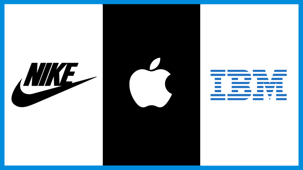
Apple uses a lot of white in its brand identity, which works brilliantly for them. White communicates simplicity and purity, and it aligns perfectly with Apple’s design philosophy of creating sleek, user-friendly technology. It sets Apple apart in the tech world, where other brands often opt for bolder, louder colors.
2) IBM:
Known as “Big Blue,” IBM uses blue to its advantage. Blue represents knowledge, stability, and trustworthiness—attributes that a giant in the tech industry would want to communicate to its customers.
3) Nike:
Nike’s use of black in their logo conveys sophistication, power, and elegance, while white offers a clean, simple backdrop that emphasizes vitality and innovation.

Combining Colors
Using a single color is straightforward, but combining colors can multiply their effect. Take Google’s logo, for instance. It uses blue, red, yellow, and green, which not only makes it colorful and eye-catching but also conveys diversity and playfulness.
Integrating Color Psychology into Your Brand Identity Design
Now that you understand the impact of colors, how do you go about integrating them into your brand identity? Here are a few steps to get you started.
1. Define Your Brand’s Personality:
Are you all about excitement and energy, or more about trust and calmness? Your brand’s personality should guide your color choices.
2. Consider Your Audience:
Different cultures perceive colors differently. Make sure your color choices resonate well with the demographic and cultural context of your target audience.
3. Test Your Colors:
Before fully committing to a color palette, test it. See how it looks on different media and get feedback from potential users. What emotions do the colors evoke in them?
4. Stay Consistent:
Once you’ve chosen your palette, use it consistently across all your marketing materials. Consistency helps reinforce brand recognition and ensures that your brand identity remains unified. Wondering how to maintain this consistency online? Consult with us to know how we can make your brand have a consistent visual identity across all platforms.
Bringing It All Together
Color is a powerful psychological tool in brand identity design. You can influence how people perceive your brand at a deep emotional level if you choose the right colors. Remember, the best color choices are those that reflect your brand’s personality, resonate with your target audience, and differentiate you in the marketplace.
In the end, the colors you choose are not just about style—they’re about substance. So, think carefully, choose wisely, and watch as the right colors begin to paint your brand’s success story.


